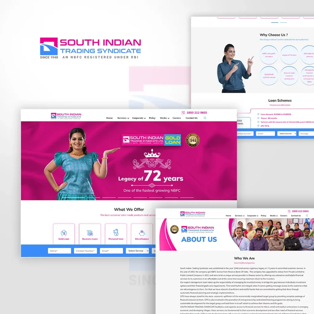
South Indian Trading Syndicate is an NBFC that provides financial services.
The requirement was that the brand identity should follow the design aspects and color palette of their parent company. They required a logo that matched the shape and theme “Way To Opportunities” of their mother company. With our expertise, our magnificent designers sculptured a design shaped like an “S”. Though building the shape and abridging it into the design was a bit challenging, it was done flawlessly and elegantly.


 Schedule An Appointment